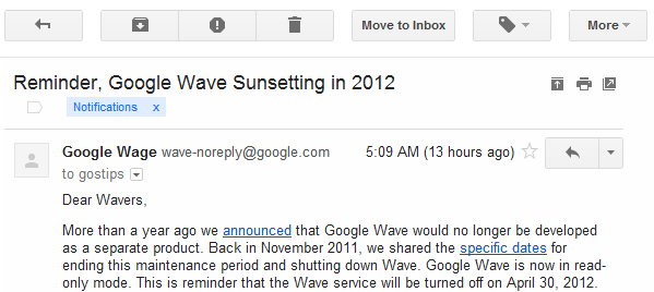
Before:

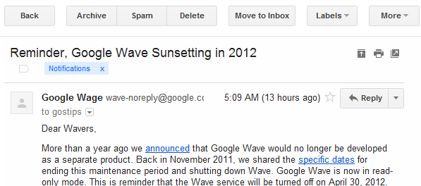
After:

"Icons brought consistency across languages and solved problems with functions that had long names. Some people loved the new icons. Others, especially low vision users, found words easier to distinguish," says Google.
My main issue is that some of the Gmail icons aren't very helpful. For example, it's not obvious that the exclamation mark is an icon for reporting messages as spam. The icons are also small and monochromatic.
{ Thanks, Sterling. }


